
Film Posters & Research for short film 'Folie à Deux'
- 2011545
- Nov 12, 2021
- 5 min read


As one of the final outcomes for this project I produced a series of five film posters (shown above) inspired by the film posters of blockbusters I've researched. I made them all using Adobe Photoshop, but designed the 'logo' and text for the film using Adobe Illustrator, using some fonts from https://www.dafont.com/ as well as some readily available fonts and brushes on the Creative Cloud software.
Film posters and their variations
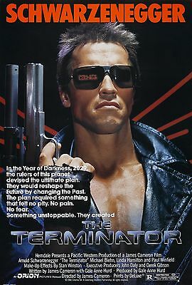
My aim was to create a range of different posters, suitable for different audiences as well as capturing different scenes within the film that may pique someone's interest. It reminds of how in different countries, famous films are marketed globally with posters that suit the culture and language there; as well as the traditional norms and laws about the specific type of content that is allowed to be shown on billboards and posters. One example of this is 'The Terminator' (1984). Below are examples of the original English film poster and the Japanese version from 1985; they are similar in many ways but the Japanese poster has more vivid colours, more detail and effects that show he is a robot, with the compass, crosshairs, text and code. Overall it is a lot better and more eye-catching than the original English one.


However the film posters I produced were all in English yet used different layouts and background images capturing different important scenes throughout the movie to give it some variety. 'The Terminator' (1984) only uses variations of one specific film poster, however for the film 'Ready Player One' (2018) has a variety of different posters for the film, using many different colour palettes, fonts, photographs and editing techniques. A simple Google search (as shown below) shows this variety of English language as well as foreign posters:

Film posters that I created for my short film
For my posters I created 5 different versions; each experimenting with different techniques as well as the layout. Due to the way the photographs were taken as well as the footage for the film, they are all in landscape; like on a billboard. However I could adapt them for portrait adverts such as on the side of a bus stop. On my posters I also decided to add some small writing with all the credits at the top and on the sides to make it look more authentic.

This particular poster (shown above), which I decided to use as the main one for the film took the longest amount of time to create. Initially I started with an image of a scene with Natasha sitting on a chair in this bleak room (in her own dream).
One of the main themes of the film is that sense of connection with someone else, specifically one other person, when they take control of you emotionally and physically. I wanted to communicate this in the poster so I drew some outlines of Natasha and I (as the main characters) which are shown in the poster as dark silhouettes on the left and right which were a separate png file I traced over different photos of us both. I intended to use these shapes on all of my posters, but I eventually decided it wasn't necessary as I wanted some variety with the posters.
Perhaps the hardest part of creating this poster was using the tools on Photoshop to create the silhouette sitting on a chair (on the left half of the poster, right next to Natasha). I masked an image of me simply sitting down and simply coloured it in black, similar to what I did for the silhouettes; then I had to create the chair and shadows. This was a rather long-winded, experimental process in order to work out what to do. However I masked the chair from the original photograph, and used the brush tool to just trim roughly down to the chair legs (I intended the image to have jagged/distorted edges to make it look scarier). To create the shadow, I essentially duplicated everything, dragged it slightly to the left to give an illusion of a shadow; set the opacity to 50%, and finally used the smudge tool and dragged the layer to smudge the borders, creating a freaky, disorientated looking shadow.
Lastly I used Adobe Illustrator to create the 'Folie à Deux' graphic which I used two different fonts for, as well as the charcoal brush tool around the word 'deux' to create a particle effect, and used a third font for the credits. The tagline 'a madness for two...' (translation of the film title) used one of the fonts in the title as well.

Using a lot of the same graphics (the format of the title and the credits) as the first poster for consistency, I chose another shot from the film that I thought was rather pivotal in its storyline. It was a scene where Natasha wakes up from her unconsciousness in the film, and runs around in her vicious circle of madness and fear as she struggles to piece together what is going on. I accentuated the colour of the red, and added the tagline 'nothing else matters without you'; which again ties in with the theme of attachment to someone else, a theme prominent both in the film and in my life, which is where I got the inspiration from.

In this poster I captured probably one of the most recognisable scenes in my film, when Natasha comes to a halt after she was running around in fear and madness, and looks at herself in confusion. She does not realise her shadow has left her. I also used black text instead of white for it to stand out over the rose/pink colour in the background. The tagline I used for this poster below the credits; 'what do you do when they're gone?' is rather self-explanatory in terms of how it relates to the film.

In this poster I captured the scene where Natasha passes out onto the floor after she trips in the hallway, falls into a coma and begins to dream. The difference between this image and the shot from the film is her face, half of my face is deliberately edited into it, like a morph from her into me. I included this edit to represent the two halves of the character in different dimensions, as in the film, when my half leaves her, she descends into madness and fear. The irony in the tagline is sort of like a lesson to everyone rather than something applicable to the film; as Natasha did not have a choice with her other half in the film - it was a part of her. This is also what modern relationships can feel like - the message reaches beyond the film; 'never, ever give yourself to someone'.
I am grateful to my classmates, Danny, Arren and Zoe who helped editing specific features of the film posters I created such as the reflected figure of me sitting in the chair and its shadow as well the morphed faces in the poster above.


Comments